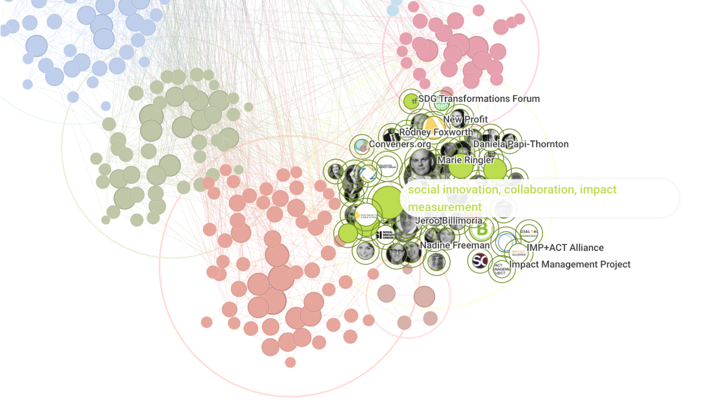
Visualising the field and practice of systems change
We know that to achieve systems change there needs to be a high level of collaboration and coordination, access to valuable frameworks, processes and tools and practitioners from a wide range of lineages. However this emerging field is fragmented, with few connections, and has a greater influence from people and practitioners from a white, western and academic culture.
To tackle this, the Illuminate network set out to support the emergence of systems change practice by visualising the field with hopes to create stronger connections among people, organisations and resources, and to recognise the international field with equity at it’s core. As practitioners ourselves, we realised we needed to use our tools on ourselves to help us to see the wider whole.
This project was initiated in 2020 with some initial questions like, as a small group of the larger whole building the field - who are the others? This project was led by the School of System Change, and designed by Eric Berlow - ecologist, complexity scientist and CEO of Vibrant Data Labs – a social impact data science group.
Here we’re giving a quick overview of the project with a tutorial from Eric on how best to use the map. There is an opportunity to fill out the survey below if you’d like add yourself or others. If you’d like to read a more in depth overview of the methodology and sensemaking, please check out the blog post here: Sense-making from visualising the field of systems change.
The Map
What we have is an affinity map that connects language: how people and organisations are talking about themselves in the field - the words they’re using, the capacity they’re putting forward, what domains they say they are working in, and how those map out across the group that we currently have here. What this map does is then start to cluster the most common terms, for example - stakeholder engagement and facilitation are most commonly found together, as is social innovation, collaboration and impact measurement. The connections that appear in the map doesn’t say anything about people knowing each other or not, it’s really about using language as a way to create connections in the field.
A walk-through from Eric, Vibrant Data Labs
This video is coming soon!
Actions
There are several ways to be involved in this project.
Provide feedback here @ illuminatesystemschange@gmail.com


